Data
Visualization
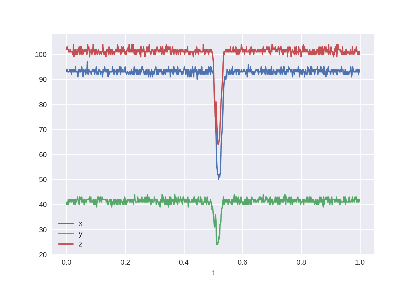
If we visualize the sensor readings during one second, when a coin is passing by, we note that there is little time (around 50 milliseconds) to get useful data:
(Source code, png, hires.png, pdf)

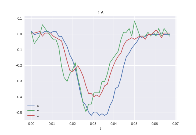
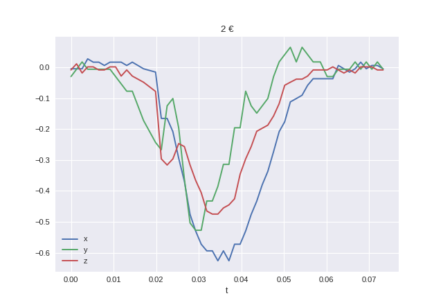
Each of the axis has a different iddle-state reading, so we can normalize the readings by first dividing by the average iddle-state reading and then substracting 1 to have an iddle-state reading of 0 in all axis and also to have data curves that represent relative variations of the magnetic field instead of absolute.
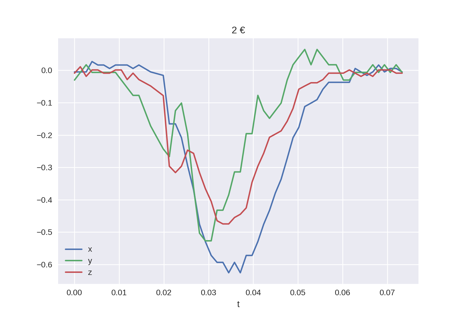
After doing this normalization we can visualize our region of interest for both 1 € and 2 € coins:


Differences
Having a look at the previous curves we might notice some differences between the 1 € and 2 € curves. Among them we might notice a small difference in the time span. Although that makes sense (the 2 € coin has a bigger diameter than the 1 € coin) and we would expect it to alter the magnetic field for a longer period, this is assuming the speed is the same for both coins. That, of course, is not very reliable, as we could simply insert coins with higher speed when pushing them down the ramp. Therefore, we will ignore differences in the x-axis (time) and focus on the y-axis (magnetic field relative variations).
In order to be able to compare curves and try to differenciate among different coins, we did some simple feature engineering to try to extract some curve features that are relevant and easy to compare/match against known profiles:

Engineered features.
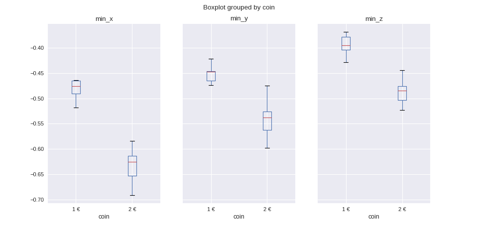
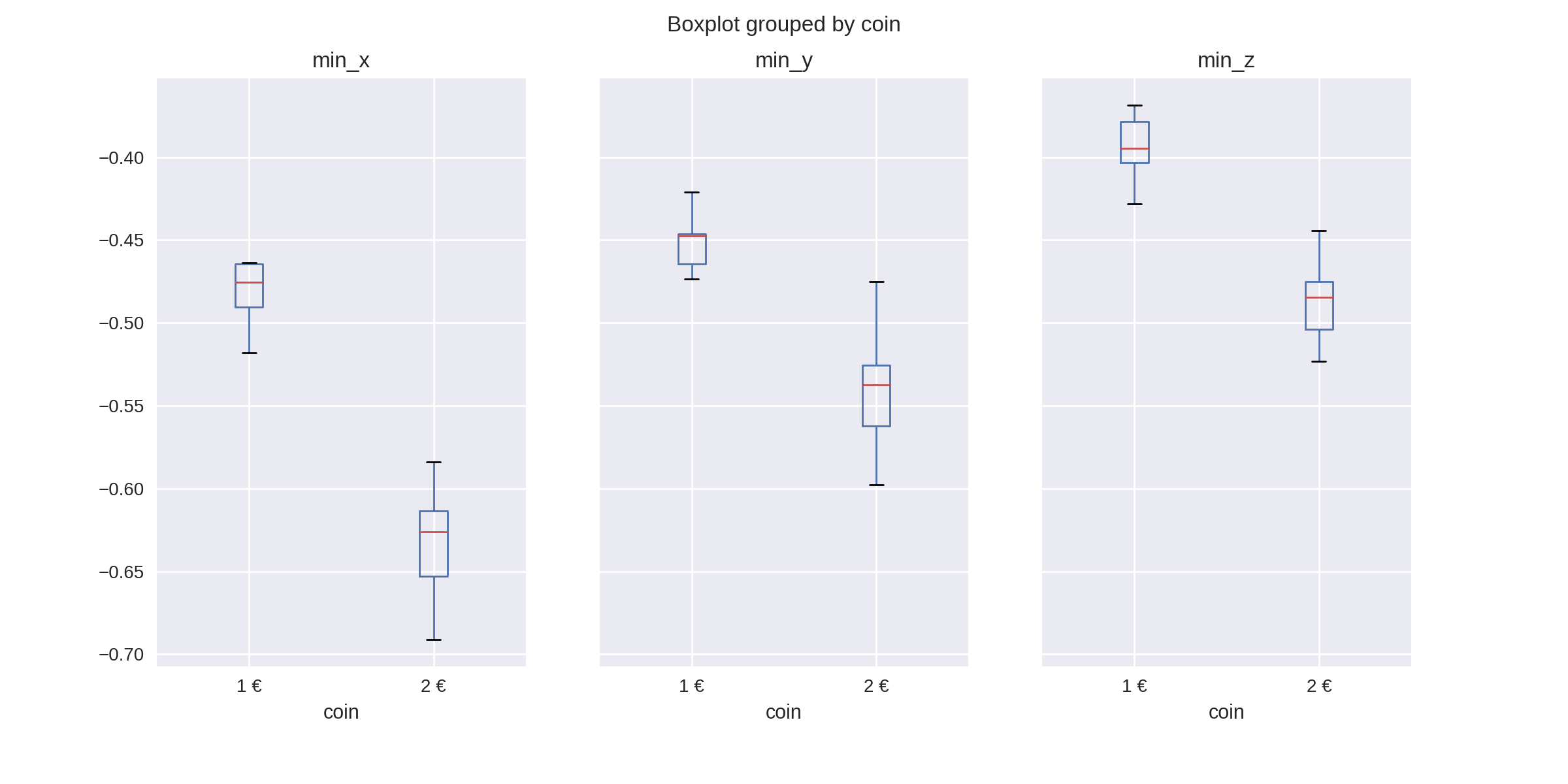
- min_[axis]
- Represents the absolute minimum value, for the given axis.
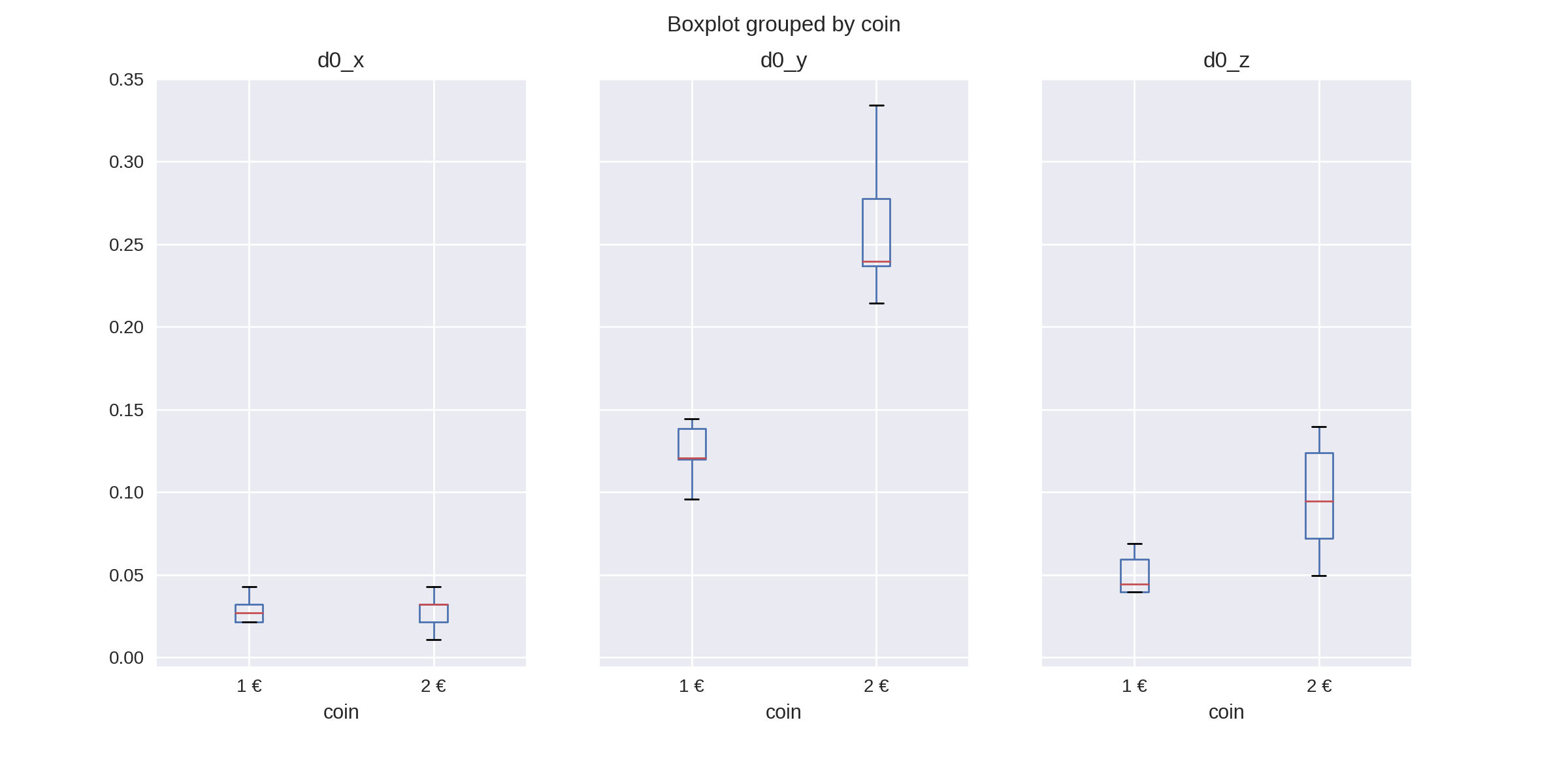
- d0_[axis]
- Represents the maximum positive increase since the last rolling minimum from the iddle state and until the absolute minimum is reached, for the given axis.
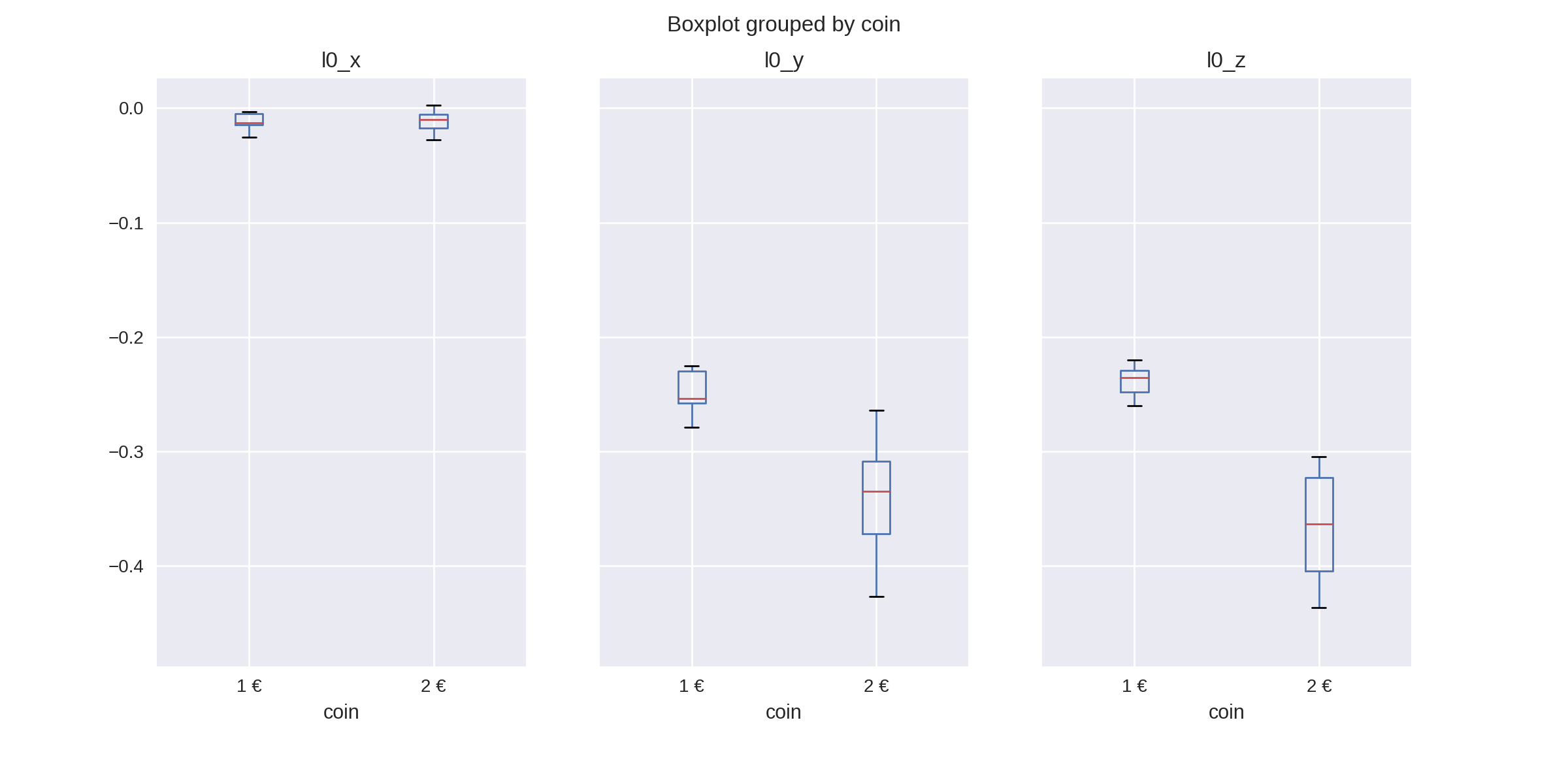
- l0_[axis]
- Represents the low value where
d0_[axis]started, for the given axis.
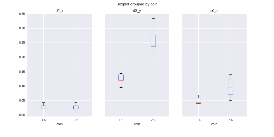
Although the differences for those engineered features might seem obvious for the curves shown above, we want to make sure that the differences are significant on average for all the data we gathered.
To visualize these differences we can use box plots for all min, l0 and
d0 features, for all axis as well:


We can see there are many significant differences between the two coins. Although we could use only the most significant among them it is better to simply use all features. Matching against the average plus some expected deviation we can not only differenciate between 1 € and 2 € coins, but also detect unexpected (potentially fake coins) readings.